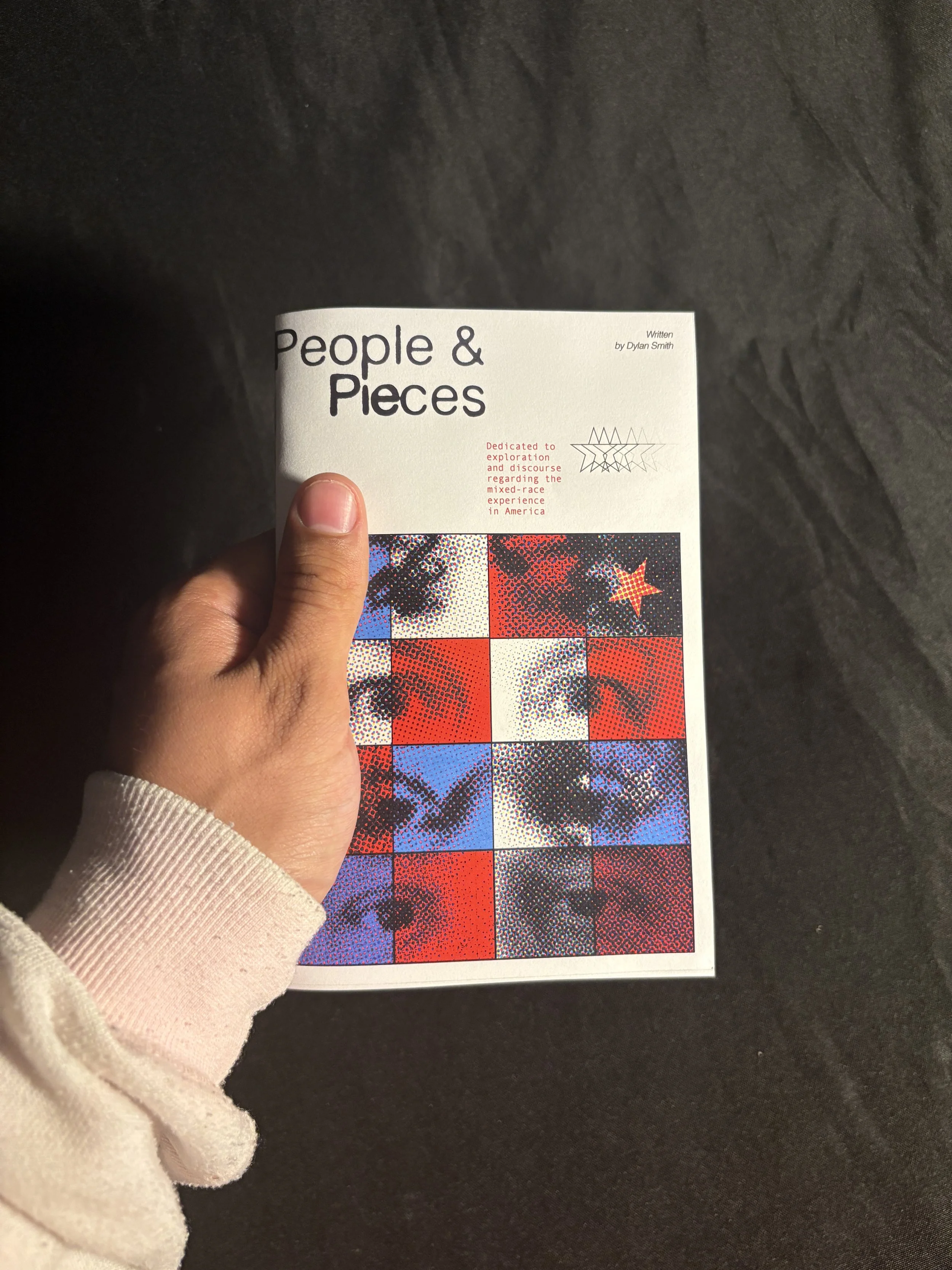
People & Pieces
2024
Overview
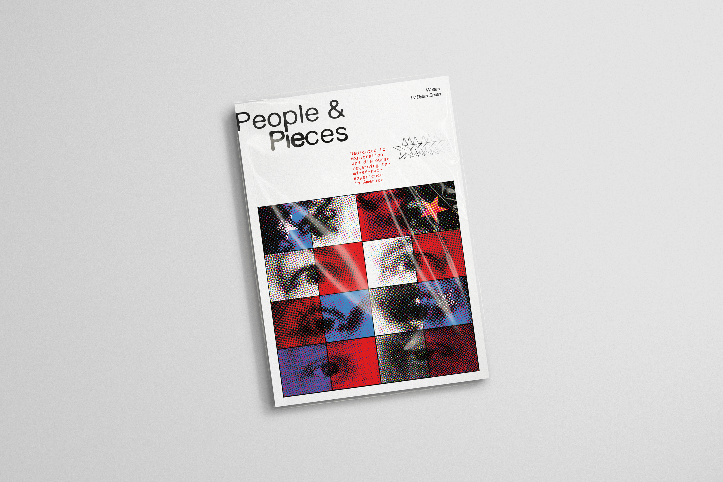
People & Pieces is a self-directed zine that explores my lived experience as a Black-White mixed race individual growing up in America. The project challenged me with combining personal narrative and academic research to navigate how identity, perception, and belonging are shaped by race.
The zine reflects on moments of ambiguity, tensions, and self-definition that often accompany the mixed-race experience. Alongside these personal reflections, I actively integrate scholarly research to relate my experiences within broader cultural and historical contexts, allowing the work to function both as an intimate record and a research-informed exploration of mixed-race identity in America.
Photography
Zine Design
Design Research
Brand identity
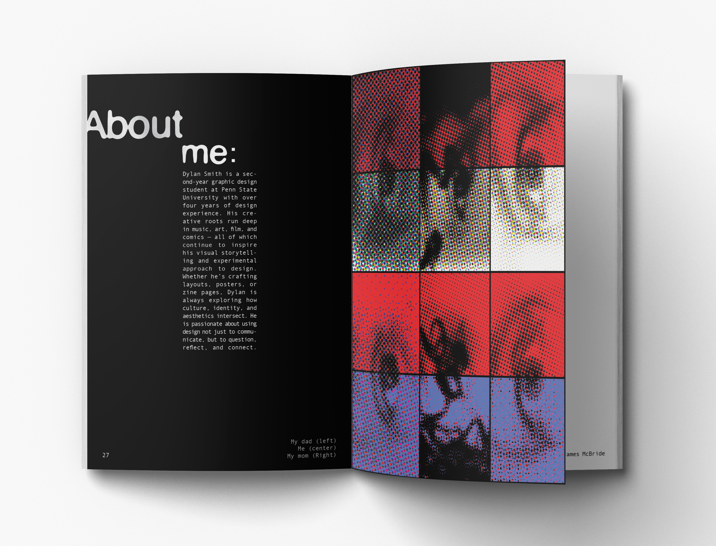
I took photographs of myself, friends, and family
that were then stylized to reflect the visual system of the zine and used throughout symbolically tied to the messages of their respective sections.
The visual system deploys three main treatments, each holding its own significance within the larger story.
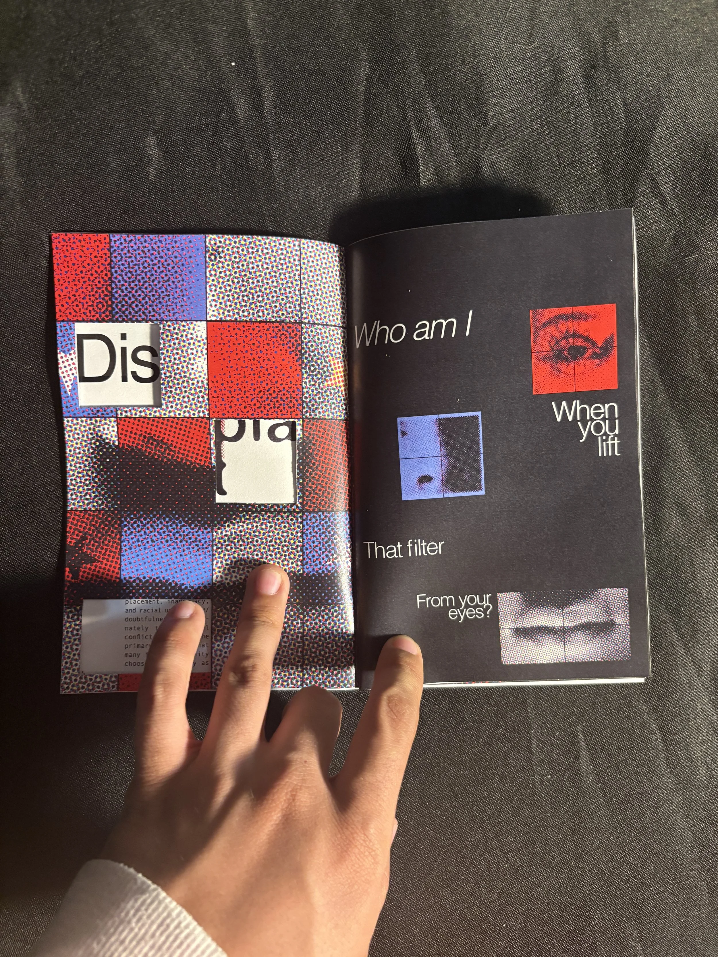
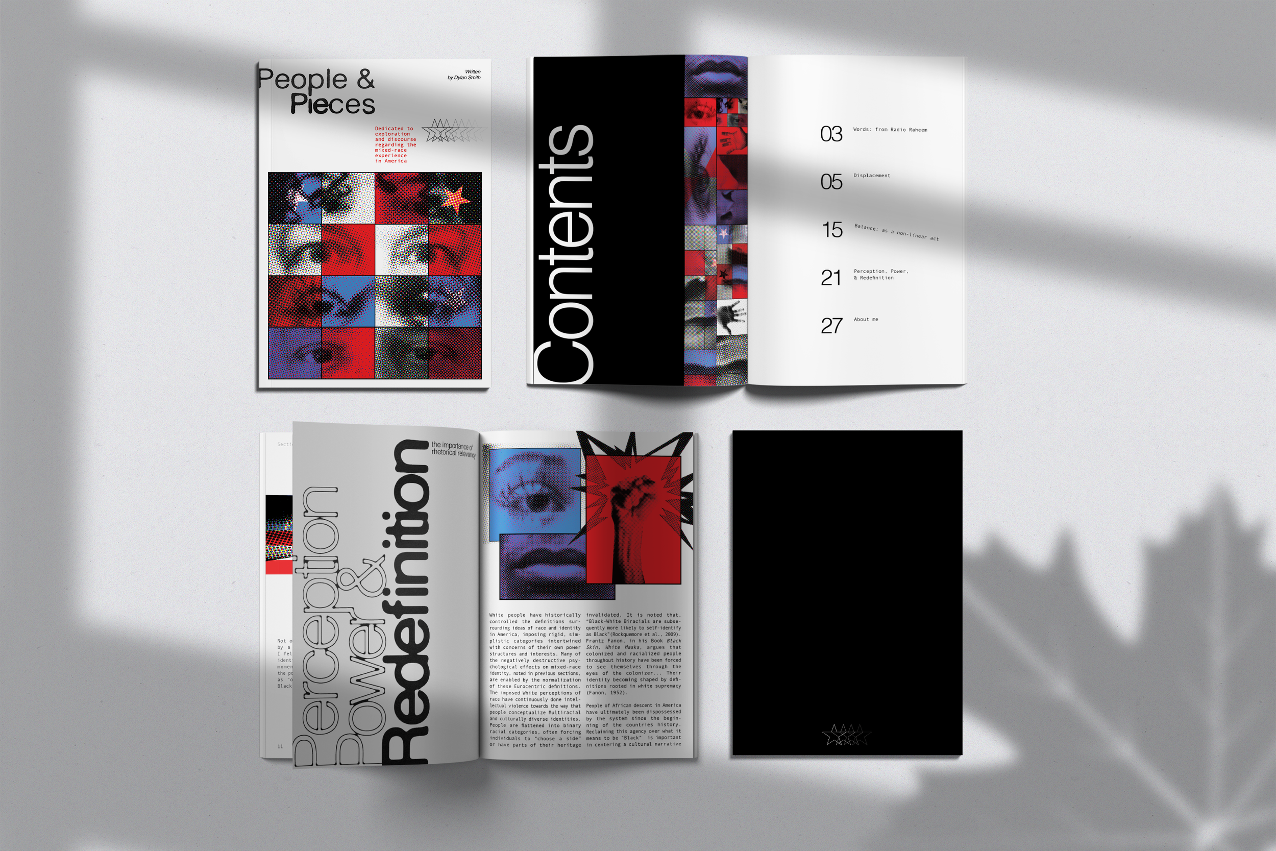
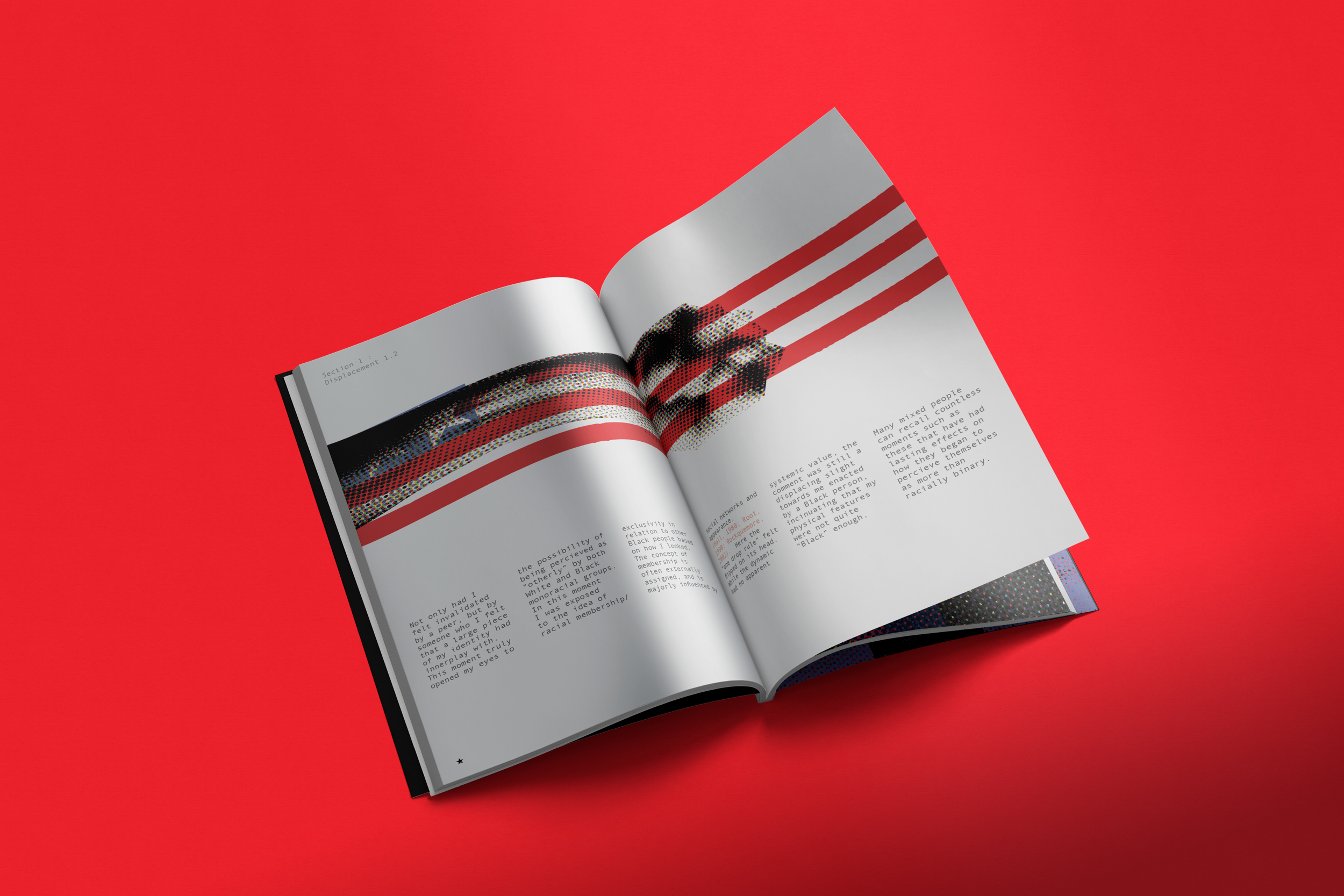
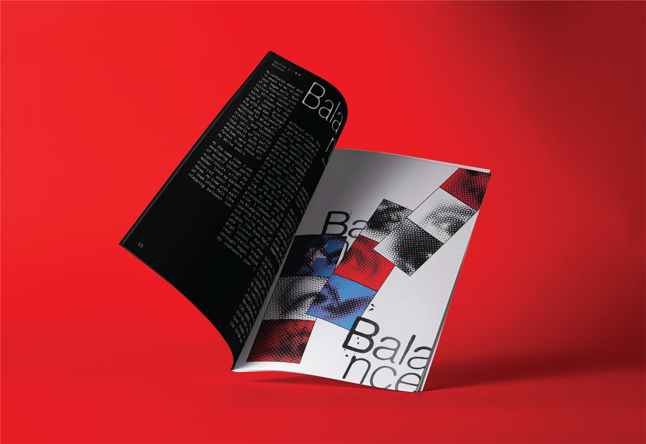
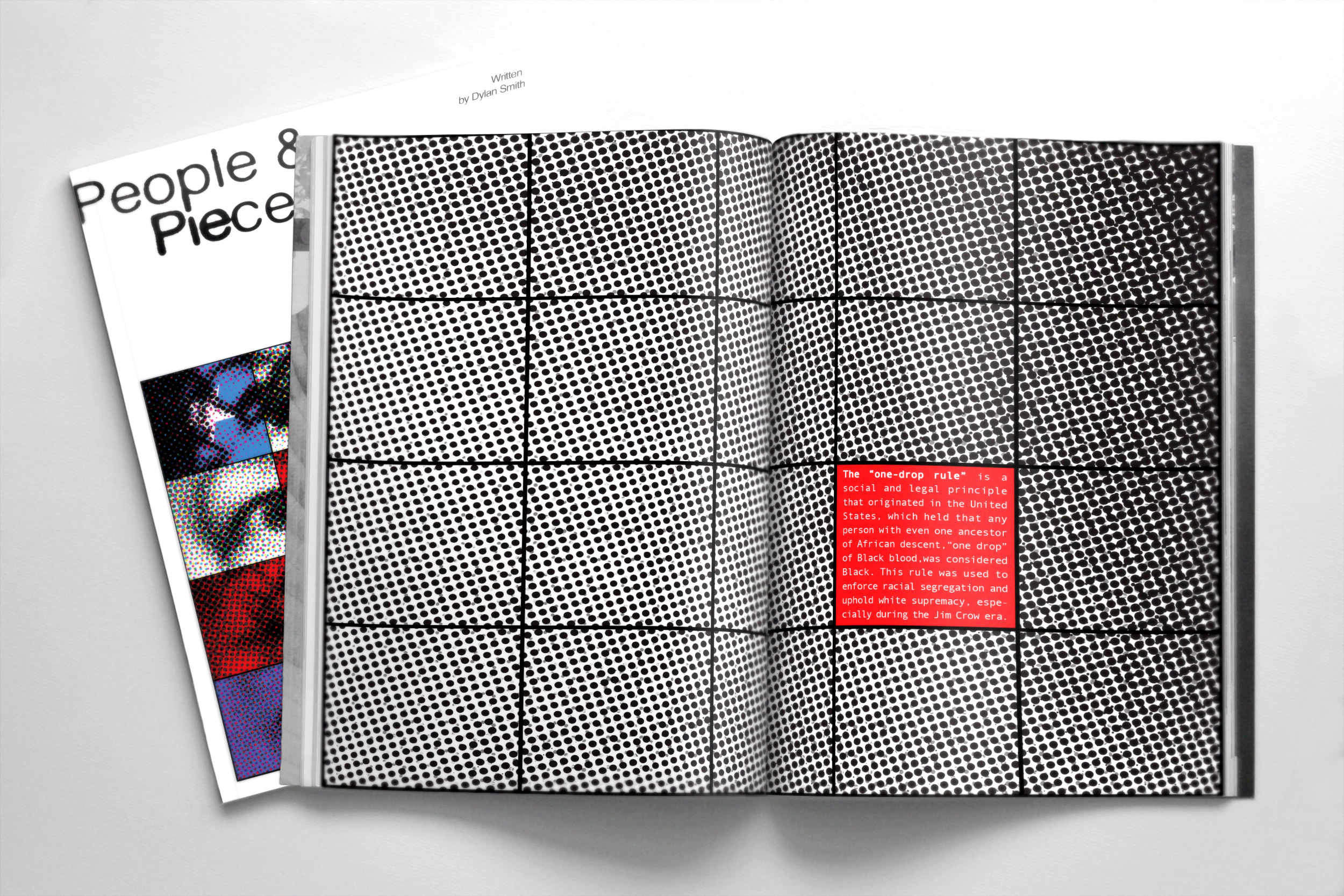
Gridding is used throughout as a way of communicating rigid deconstruction.
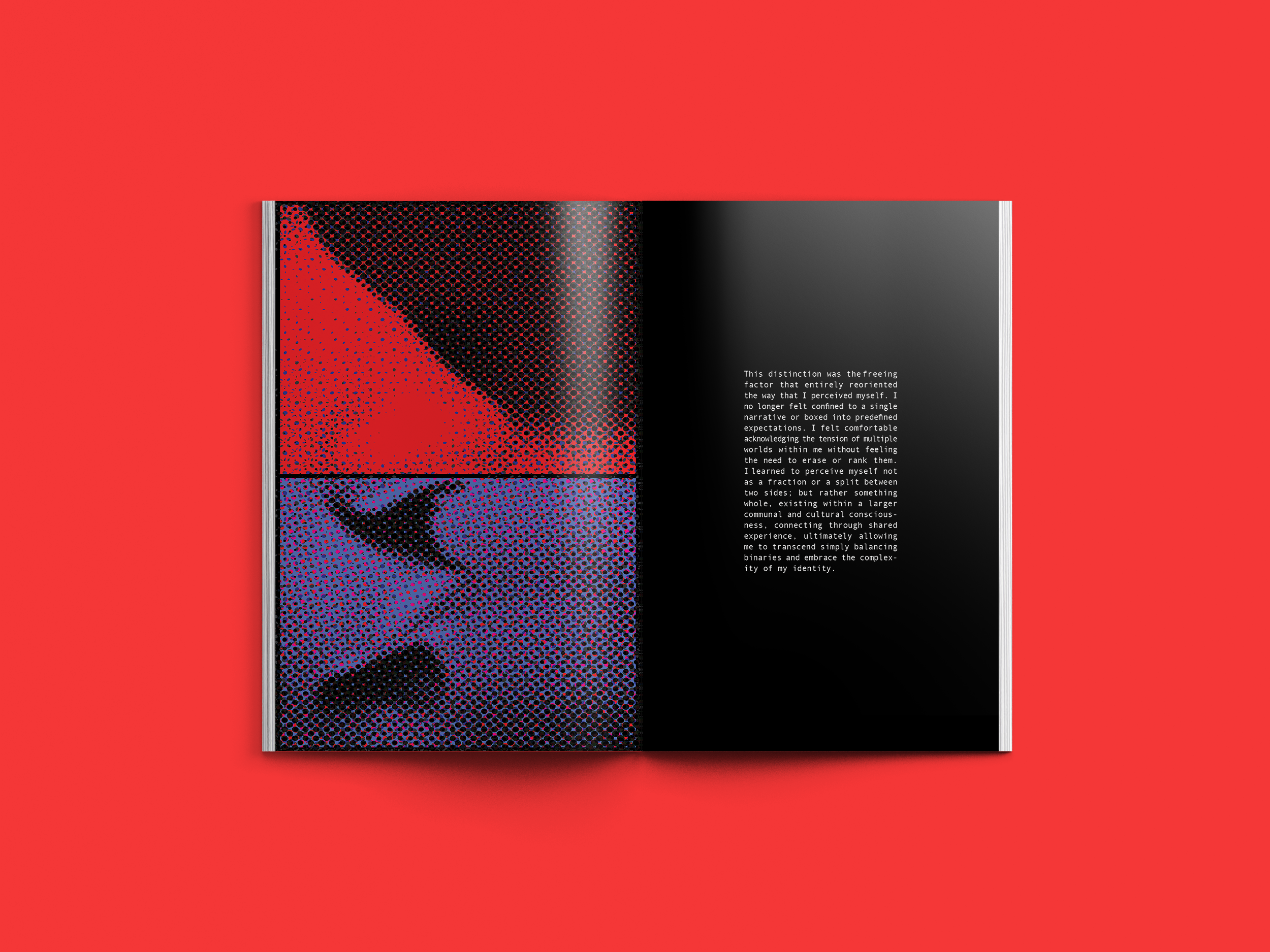
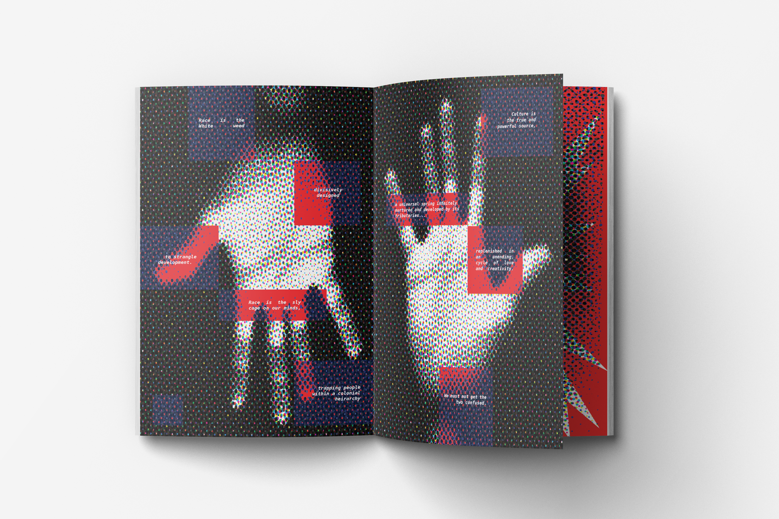
Half-toning is used as a way of distorting the imagery
to translate less clarification for the viewer. It serves as a rejection of a system that feeds on transparency and is always wishing to prevail over a fixed definition of a person, an idea, or a thing.
#d73c40
#ffffff
#618be6
Color variation is intentionally utilized
As an abstract way of showcasing the many different types of pieces that make up the whole of a person.
Because the zine explores the mixed-race experience specifically in America, I used colors that would immediately enforce a recognizable tone in relation to this scope.
The color scheme is simple, symbolic, and direct
establishing a primary thread that maintains a resilient and optimistic tone while emphasizing the transformative nature of human connection.
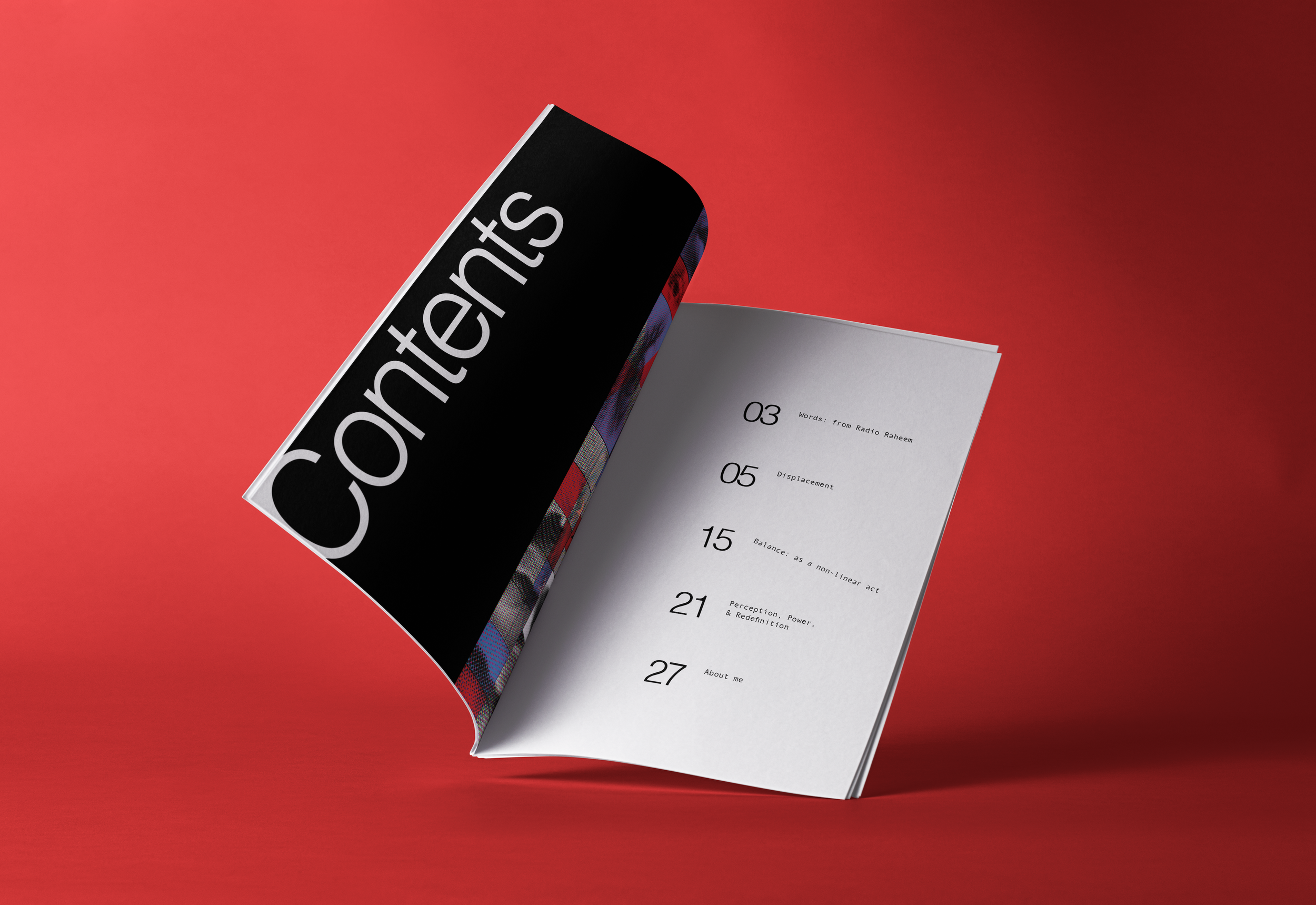
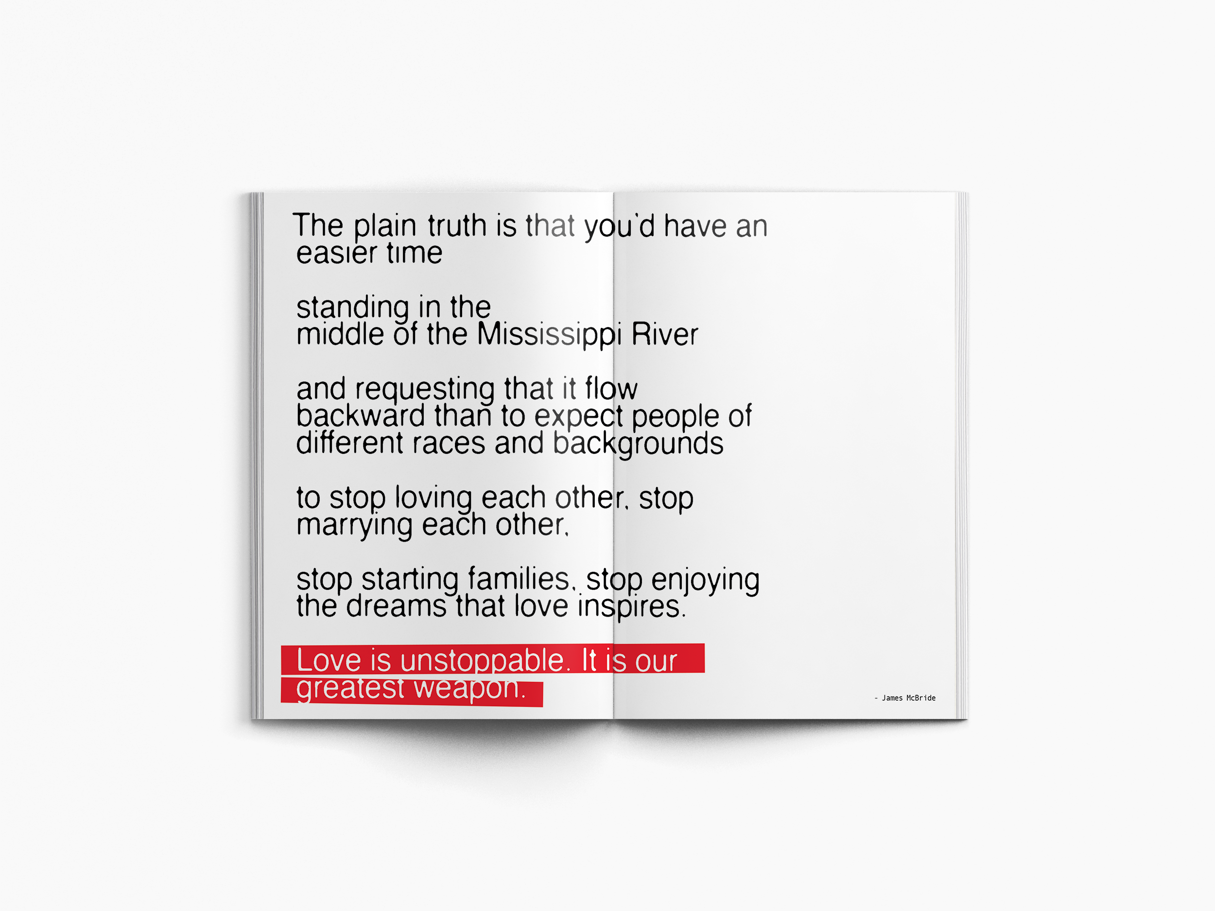
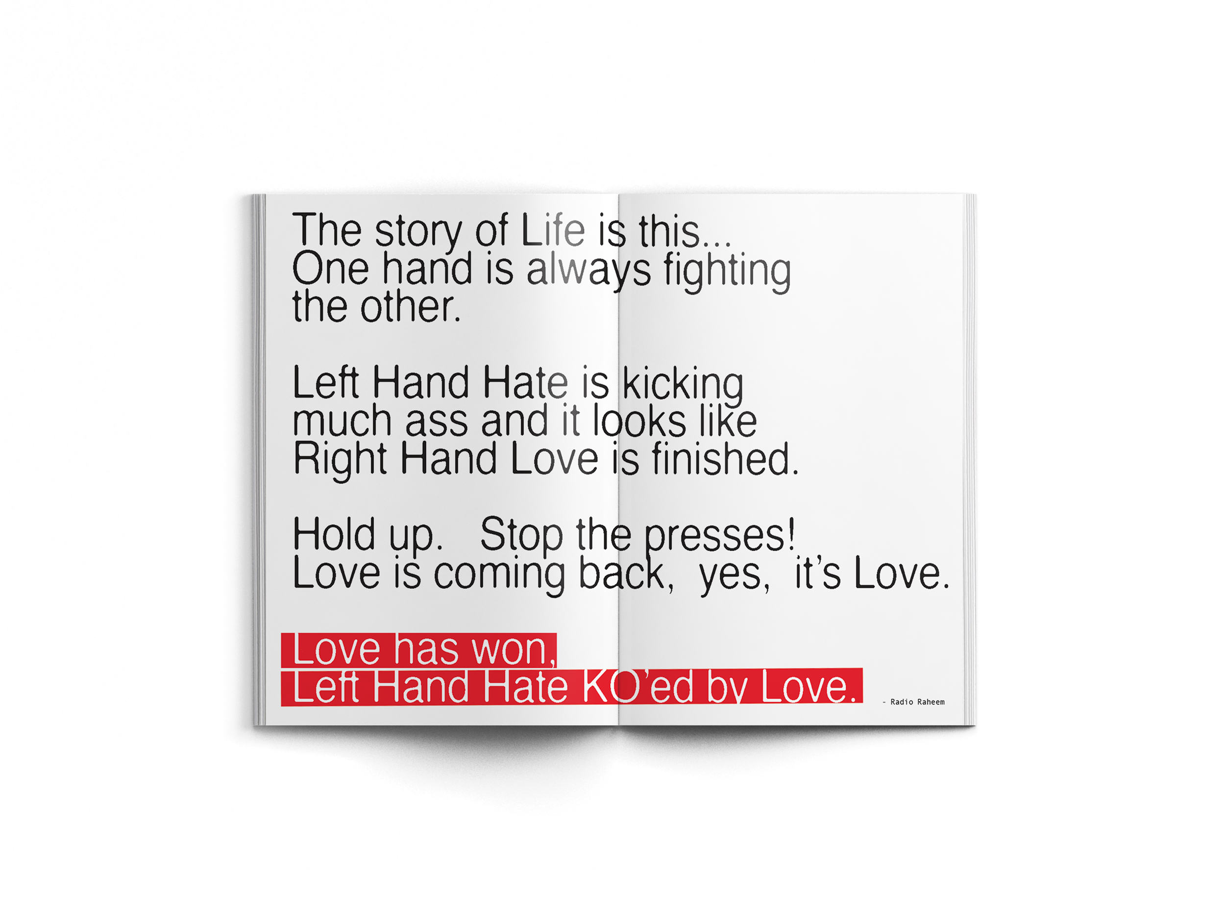
The zine both opens and closes with a quote
Process
A deeper look into the concept development
What I enjoyed most about this project was the opportunity to explore how extensively impactful research can be in informing visual systems. Through research, writing, and iterative layout exploration, I worked to balance vulnerability with clarity. Below is more insight on how I went about developing the foundation of this project.
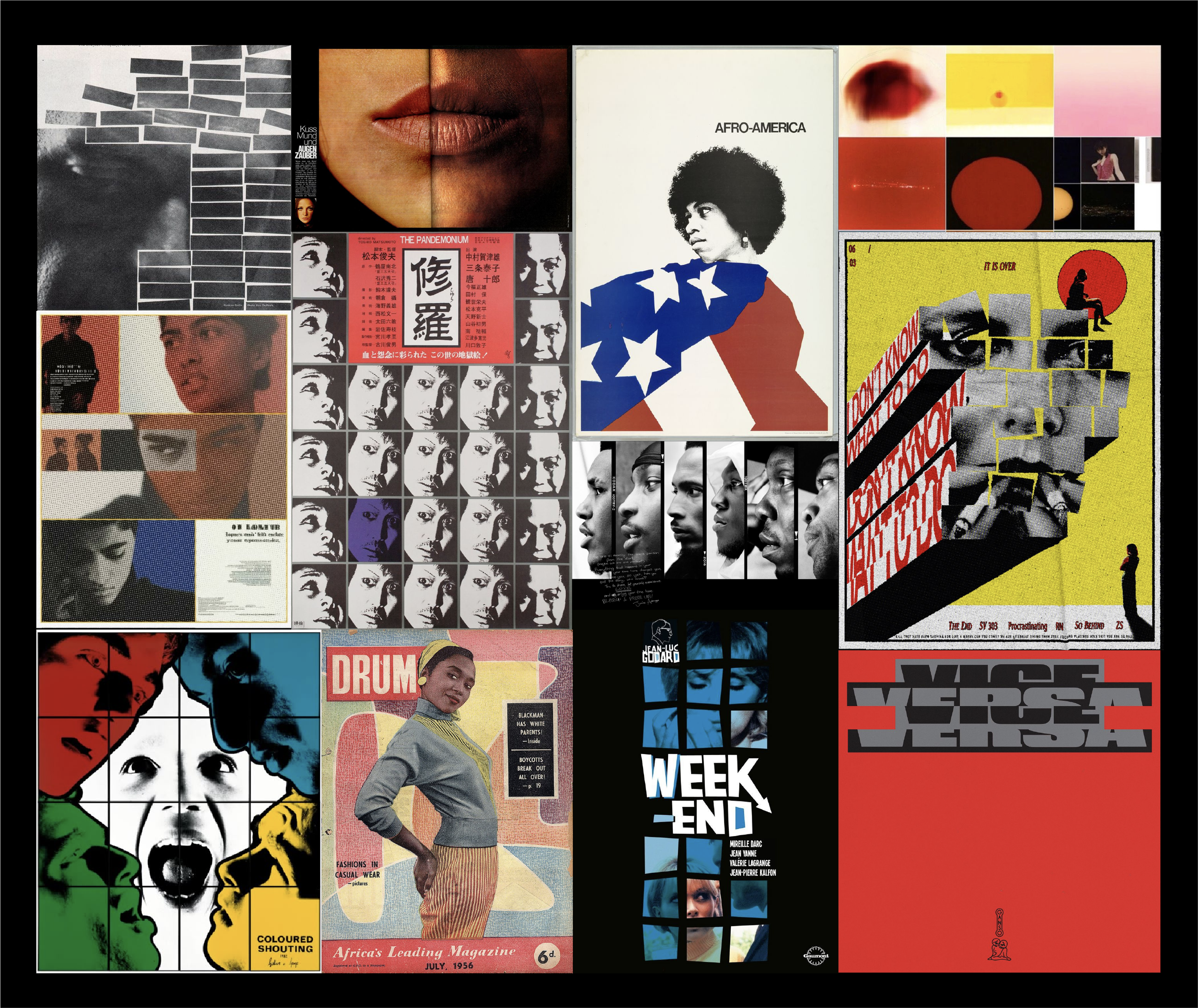
My moodboard illustrated some of the primary methods of visual communication
that I believed would be effective in translating my concept. I wanted a visual focus on gridding, scale, contrast, shape, texture, and slight disjuncture through dramatic seperation.
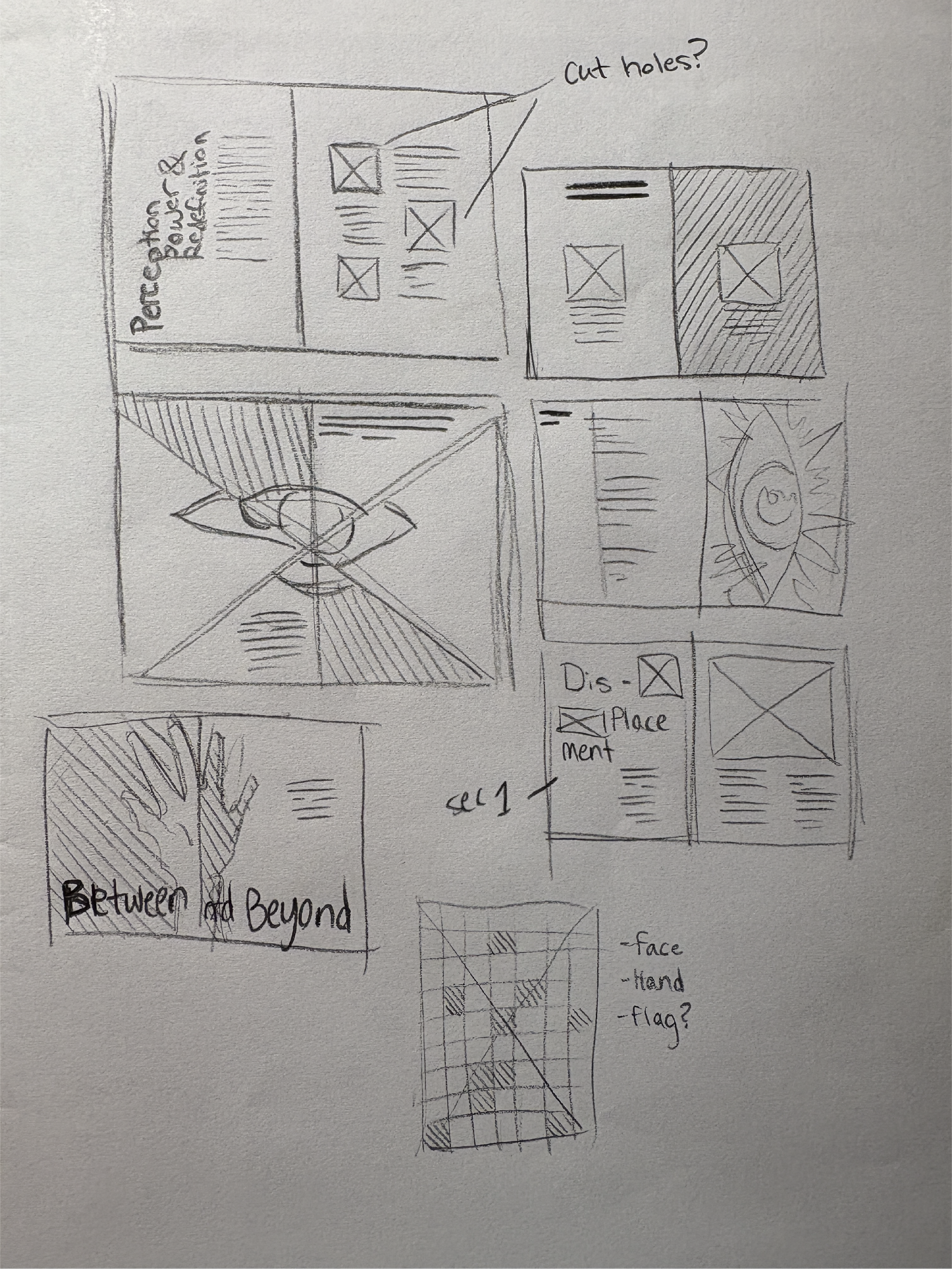
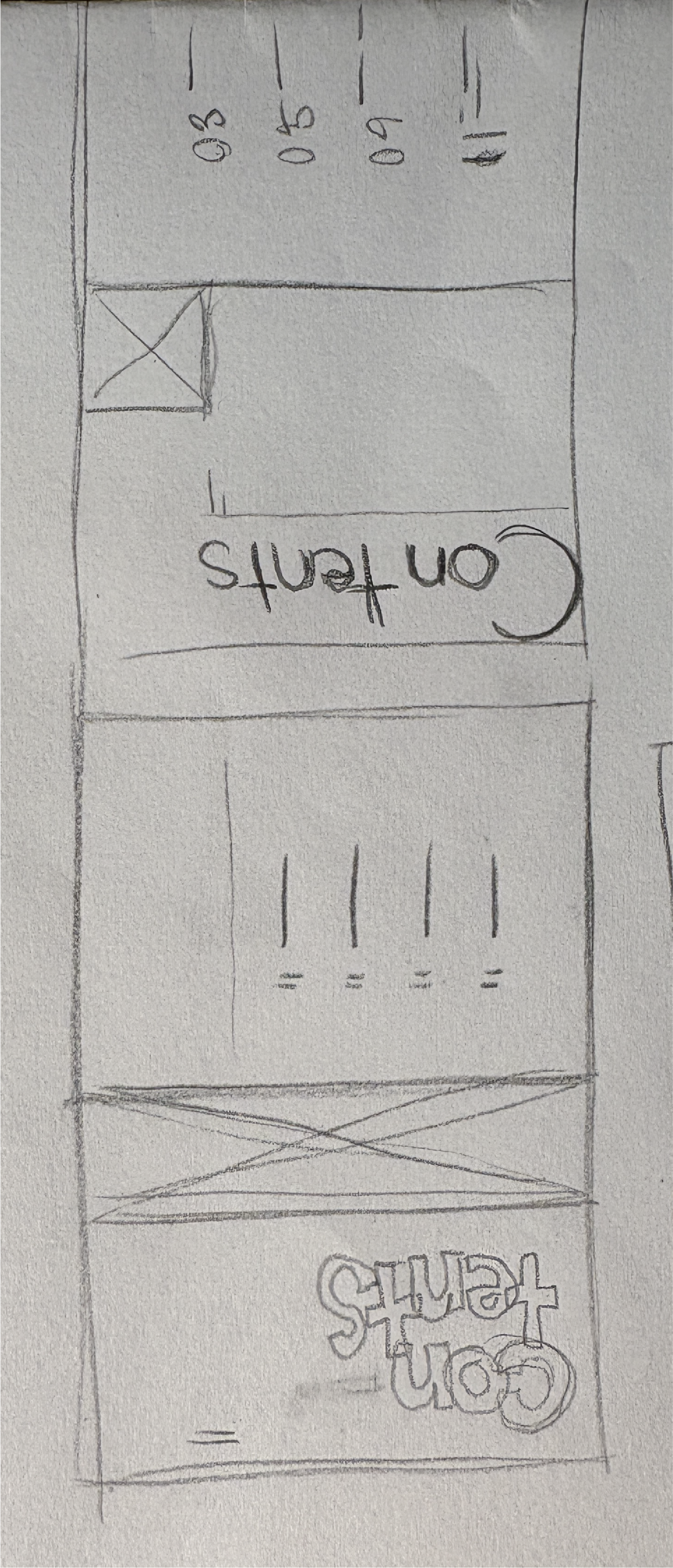

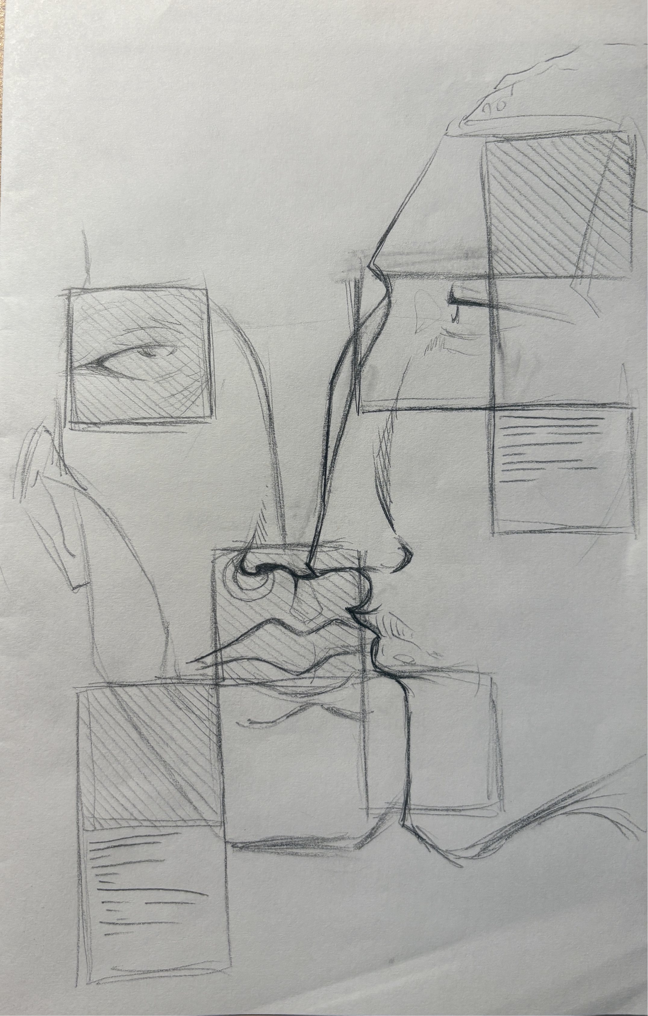
The sketching process was relatively short-lived. I used it to get my ideas flowing, mess around with some potential compositional experiments, and to roughly visualize how I wanted to implement my system. I also started thinking about interesting ways to have my design interact with the physical medium.
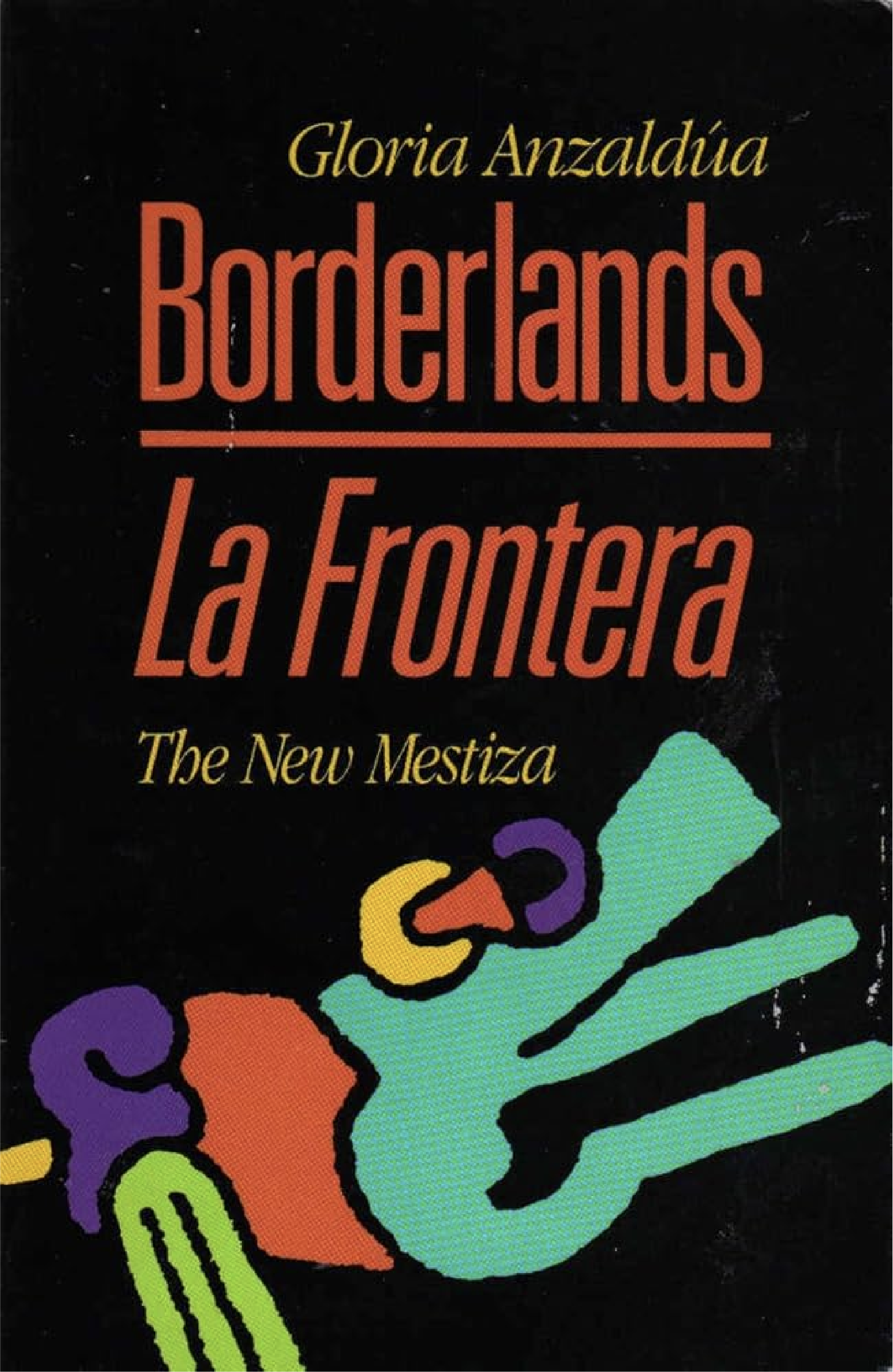
Research was an ongoing pillar of this project, drawing from a range of sources.
Included are psychological, sociological, and cultural sources on the mixed-race experience that informed many of my design choices.
Alongside academic materials, I included creative references such as quotes from books, song lyrics, and film scripts that captured relevant ideas. These layered influences shaped a zine that feels both grounded and personal.

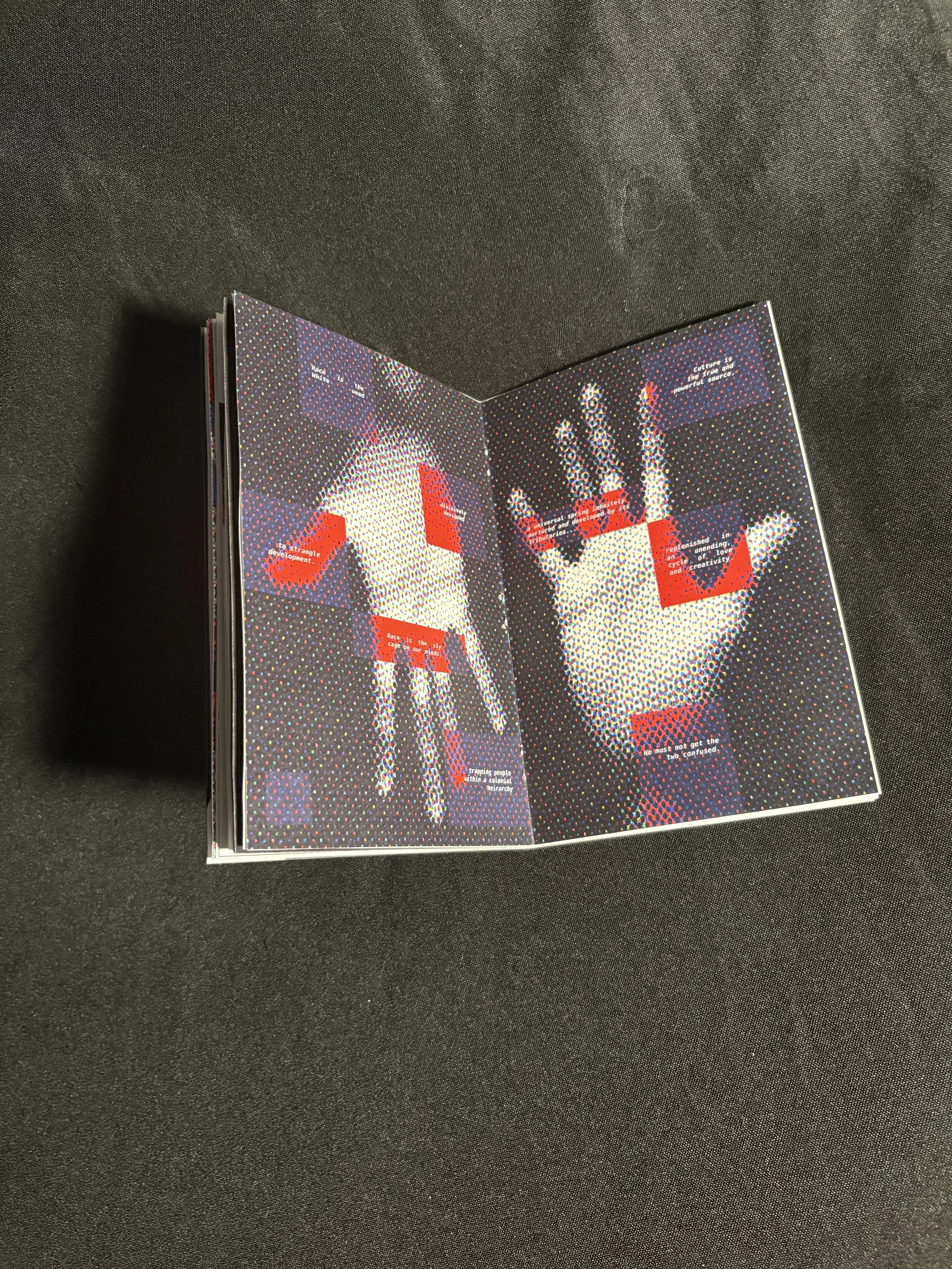
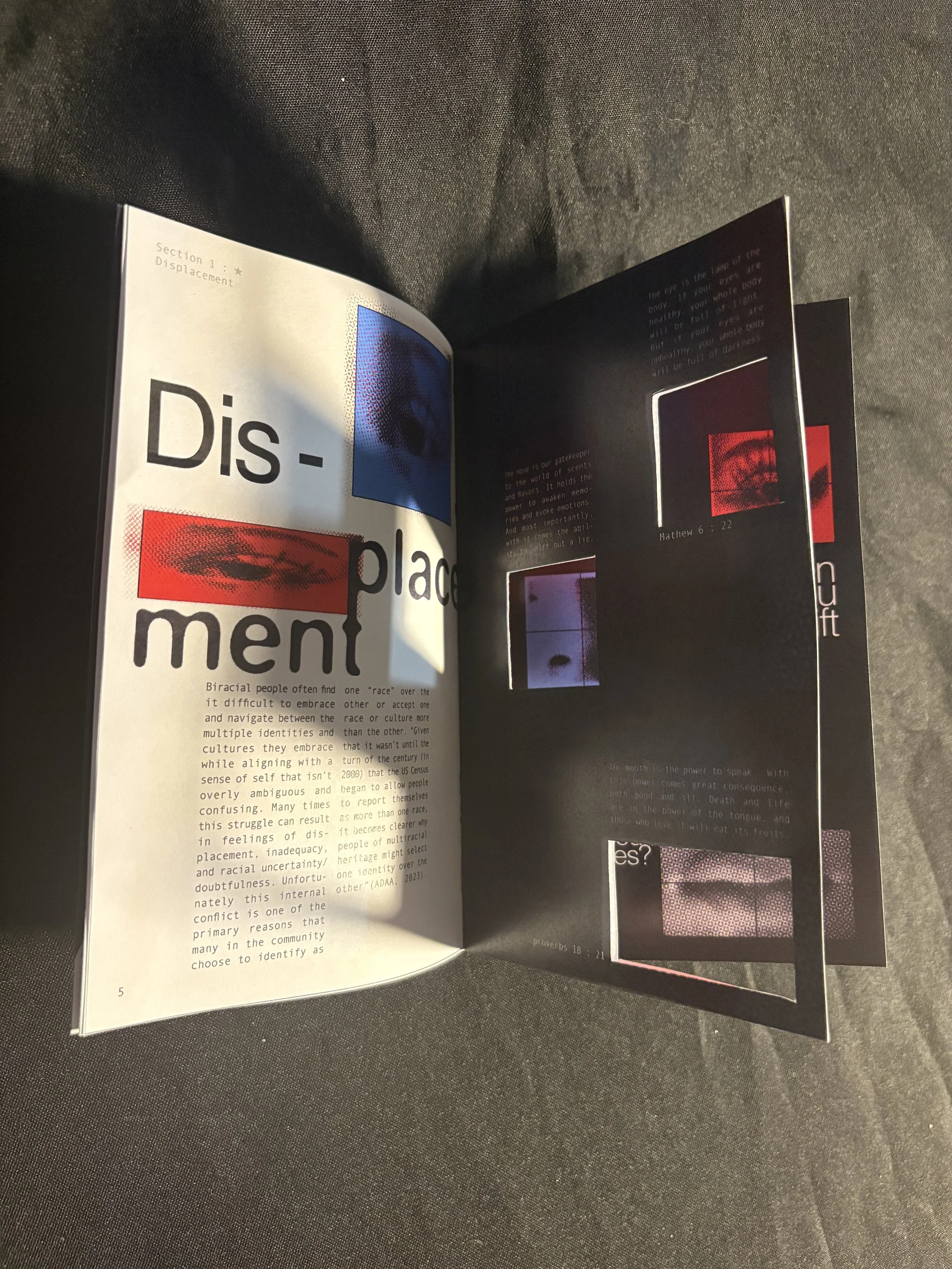
Above are a few images of the physical crafted final zine, including interactive spreads (Right side) where square cutouts expose alternate visuals and messages as pages flip.